Introduction
PCA is dimension reduction technique which takes set of possibly correlated variables and tranforms into linearly uncorrelated principal components. It is used to emphasize variations and bring out strong patterns in a dataset.
In simple words, principal component analysis is a method of extracting important variables from a large set of variables available in a data set. It extracts low dimensional set of features from a high dimensional data set with a motive to capture as much information as possible.

This post is intended to visualize principle components using python. You can find mathematical explanations in links given at the bottom.
Let’s start!
Import basic packages
import numpy as np
import matplotlib.pyplot as plt
import pandas as pd
import seaborn as sns
Load Dataset
We can use boston housing dataset for PCA. Boston dataset has 13 features which we can reduce by using PCA.
from sklearn.datasets import load_boston
boston_dataset = load_boston()
boston = pd.DataFrame(boston_dataset.data, columns=boston_dataset.feature_names)
boston.head()
| CRIM | ZN | INDUS | CHAS | NOX | RM | AGE | DIS | RAD | TAX | PTRATIO | B | LSTAT | |
|---|---|---|---|---|---|---|---|---|---|---|---|---|---|
| 0 | 0.00632 | 18.0 | 2.31 | 0.0 | 0.538 | 6.575 | 65.2 | 4.0900 | 1.0 | 296.0 | 15.3 | 396.90 | 4.98 |
| 1 | 0.02731 | 0.0 | 7.07 | 0.0 | 0.469 | 6.421 | 78.9 | 4.9671 | 2.0 | 242.0 | 17.8 | 396.90 | 9.14 |
| 2 | 0.02729 | 0.0 | 7.07 | 0.0 | 0.469 | 7.185 | 61.1 | 4.9671 | 2.0 | 242.0 | 17.8 | 392.83 | 4.03 |
| 3 | 0.03237 | 0.0 | 2.18 | 0.0 | 0.458 | 6.998 | 45.8 | 6.0622 | 3.0 | 222.0 | 18.7 | 394.63 | 2.94 |
| 4 | 0.06905 | 0.0 | 2.18 | 0.0 | 0.458 | 7.147 | 54.2 | 6.0622 | 3.0 | 222.0 | 18.7 | 396.90 | 5.33 |
Standardize data
PCA is largely affected by scales and different features might have different scales. So it is better to standardize data before finding PCA components. Sklearn’s StandardScaler scales data to scale of zero mean and unit variance. It is important step in many of the machine learning algorithms.
from sklearn.preprocessing import StandardScaler
x = StandardScaler().fit_transform(boston)
x = pd.DataFrame(x, columns=boston_dataset.feature_names)
Get PCA Components
Calculating PCA involves following steps:
- Calculating the covariance matrix
- Calculating the eigenvalues and eigenvector
- Forming Principal Components
- Projection into the new feature space
This post is more about visualizing PCA components than to calculate and fortunately sklearn provides PCA module for getting PCA components
In PCA(), n_components specifies how many components are returned after fit and tranformation.
from sklearn.decomposition import PCA
pcamodel = PCA(n_components=5)
pca = pcamodel.fit_transform(x)
pca.shape
(506, 5)
PCA model attribute plots
PCA components and their significance can be explained using following attributes
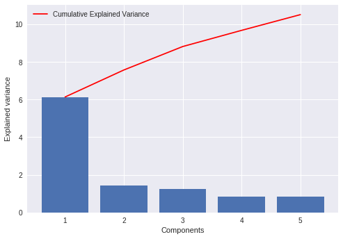
Explained variance is the amount of variance explained by each of the selected components. This attribute is associated with the sklearn PCA model as explained_variance_
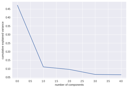
Explained variance ratio is the percentage of variance explained by each of the selected components. It’s attribute is explained_variance_ratio_
pcamodel.explained_variance_
array([6.1389812 , 1.43611329, 1.2450773 , 0.85927328, 0.83646904])
pcamodel.explained_variance_ratio_
array([0.47129606, 0.11025193, 0.0955859 , 0.06596732, 0.06421661])
explained_variance_ plot
plt.bar(range(1,len(pcamodel.explained_variance_ )+1),pcamodel.explained_variance_ )
plt.ylabel('Explained variance')
plt.xlabel('Components')
plt.plot(range(1,len(pcamodel.explained_variance_ )+1),
         np.cumsum(pcamodel.explained_variance_),
         c='red',
         label="Cumulative Explained Variance")
plt.legend(loc='upper left')
explained_variance_ratio_ plot
plt.plot(pcamodel.explained_variance_ratio_)
plt.xlabel('number of components')
plt.ylabel('cumulative explained variance')
plt.show()

#PCA1 is at 0 in xscale
Scree plot
Scree plot is nothing but plot of eigen values(explained_variance_) for each of the components.
plt.plot(pcamodel.explained_variance_)
plt.xlabel('number of components')
plt.ylabel('cumulative explained variance')
plt.show()
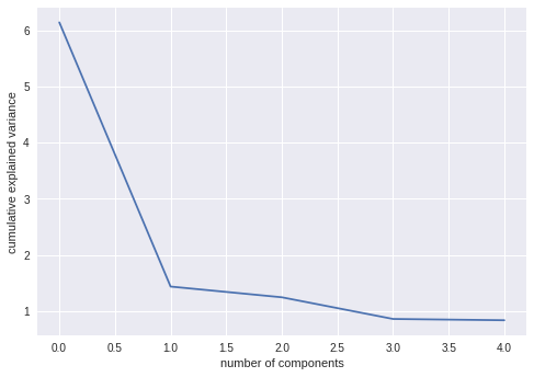
It can be seen from plots that, PCA-1 explains most of the variance than subsequent components. In other words, most of the features are explained and encompassed by PCA1
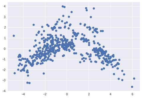
Scatter plot of PCA1 and PCA2
pca helds all PCA components. First two of them can be visualized using scatter plot.
plt.scatter(pca[:, 0], pca[:, 1])
3D Scatter plot of PCA1,PCA2 and PCA3
We can use Scatter3D library from plotly to plot first 3 components in 3D space.
#Make Plotly figure
import plotly.plotly as py
import plotly.graph_objs as go

plotly.tools.set_credentials_file(username='prasadostwal', api_key='yourapikey')
# api key hidden

fig1 = go.Scatter3d(x=pca[:, 0],
                    y=pca[:, 1],
                    z=pca[:, 2],
                    marker=dict(opacity=0.9,
                                reversescale=True,
                                colorscale='Blues',
                                size=5),
                    line=dict (width=0.02),
                    mode='markers')

#Make Plot.ly Layout
mylayout = go.Layout(scene=dict(xaxis=dict( title="PCA1"),
                                yaxis=dict( title="PCA2"),
                                zaxis=dict(title="PCA3")),)

#Plot and save html
py.iplot({"data": [fig1],
                     "layout": mylayout},
                     auto_open=True,
                     filename=("3DPlot.html"))
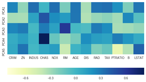
Effect of variables on each components
components_ attribute provides principal axes in feature space, representing the directions of maximum variance in the data. This means, we can see influence on each of the components by features.
ax = sns.heatmap(pcamodel.components_,
                 cmap='YlGnBu',
                 yticklabels=[ "PCA"+str(x) for x in range(1,pcamodel.n_components_+1)],
                 xticklabels=list(x.columns),
                 cbar_kws={"orientation": "horizontal"})
ax.set_aspect("equal")
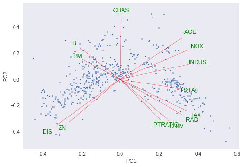
PCA Biplot
Biplot is an interesting plot and contains lot of useful information.
It contains two plots:
- PCA scatter plot which shows first two component ( We already plotted this above)
- PCA loading plot which shows how strongly each characteristic influences a principal component.
PCA Loading Plot: All vectors start at origin and their projected values on components explains how much weight they have on that component. Also , angles between individual vectors tells about correlation between them.
More about biplot here
Let’s plot for our data.
def myplot(score,coeff,labels=None):
    xs = score[:,0]
    ys = score[:,1]
    n = coeff.shape[0]
    scalex = 1.0/(xs.max() - xs.min())
    scaley = 1.0/(ys.max() - ys.min())
    plt.scatter(xs * scalex,ys * scaley,s=5)
    for i in range(n):
        plt.arrow(0, 0, coeff[i,0], coeff[i,1],color = 'r',alpha = 0.5)
        if labels is None:
            plt.text(coeff[i,0]* 1.15, coeff[i,1] * 1.15, "Var"+str(i+1), color = 'green', ha = 'center', va = 'center')
        else:
            plt.text(coeff[i,0]* 1.15, coeff[i,1] * 1.15, labels[i], color = 'g', ha = 'center', va = 'center')

    plt.xlabel("PC{}".format(1))
    plt.ylabel("PC{}".format(2))
    plt.grid()

myplot(pca[:,0:2],np.transpose(pcamodel.components_[0:2, :]),list(x.columns))
plt.show()
Source:
You can find above Jupyter notebook here
Interesing reads about PCA:
- http://setosa.io/ev/principal-component-analysis/
- https://towardsdatascience.com/a-one-stop-shop-for-principal-component-analysis-5582fb7e0a9c
- https://blog.bioturing.com/2018/06/18/how-to-read-pca-biplots-and-scree-plots/
- https://en.wikipedia.org/wiki/Principal_component_analysis
- https://medium.com/@aptrishu/understanding-principle-component-analysis-e32be0253ef0